Card Treatment Tier List 2026 Edition
It’s been a bit since we put out our first card treatment tier list back in June 2025. There have been a bunch of sets since then. With more sets come more card treatments.
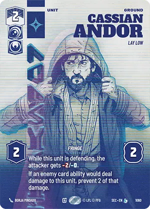
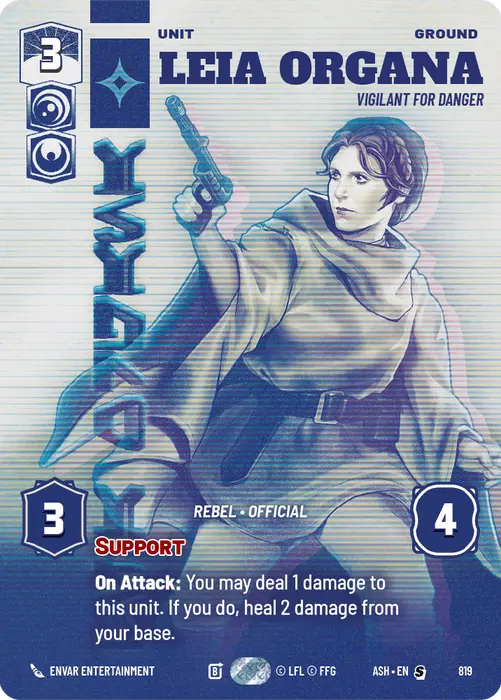
Here is our current card treatment tier list. We’re ranking the overall art treatment of the cards as a batch and not any specific piece of artwork. In each series there are some that are better and some that are worse. Overall any of these treatments could be ranked differently based on the viewer. All of them are good and the lower rankings are only just as relative to the others and does not mean they are bad.
So away we go with the consensus of the porg art critics as relates to card treatments…
S+ Tier
Showcase Leaders – Technically the showcase leaders are a card treatment different from the base printings. They are also the ultimate flex of a cool card to slap down on the table since it is guaranteed to be in play for a game. These are also the defecto chase cards that can be found in normal display boosters.

S Tier
Convention Exclusive 2025 – This style set new standards for how far card layout and foiling patterns could be pushed. While understandable that the aspect icons are shaded the same color as the rest of the card, it would have been helpful to have them actually colored correctly and stand out slightly and may be the only thing keeping this from being S+.


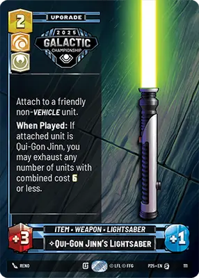
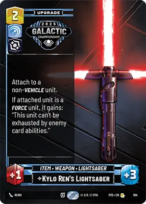
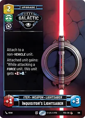
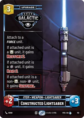
Galactic Championship 2025 Lightsabers – These really break the mold for how a piece of equipment is displayed with the detailed hilts just sitting on tables and other surfaces. Adding to the cool factor is just how rare these suckers are.


A Tier
Convention Exclusive 2024 – This was the first dip into a truly unique limited treatment. It would have been nice to have the aspects colored correctly. At least with this version being shaded in all black seems thematic for these villainous characters. Would be awesome to see this brought back at some point.


Propoganda – Meant to evoke the propaganda posters of the mid 1940’s this style put out some really incredible images.


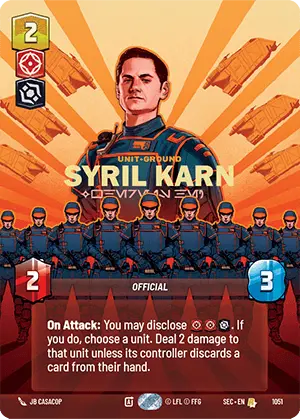
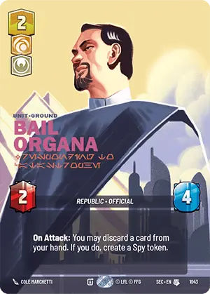

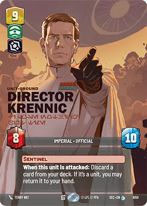
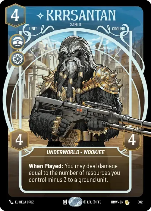
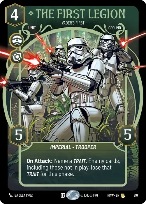
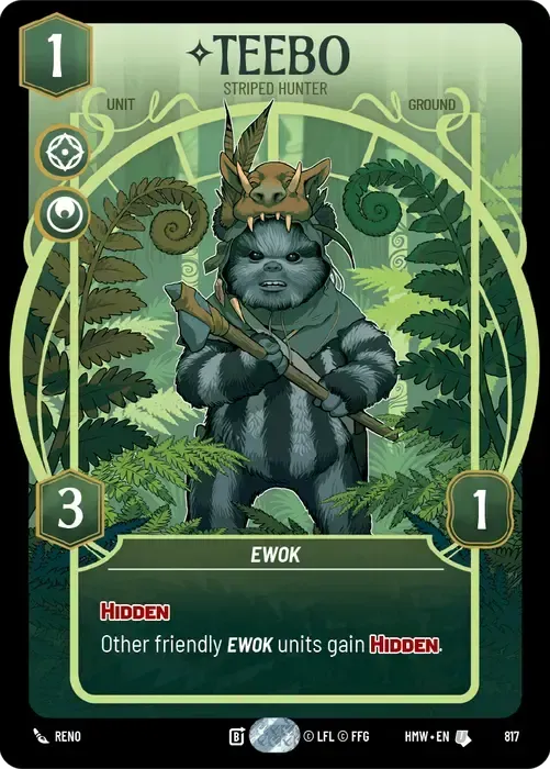
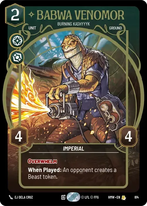
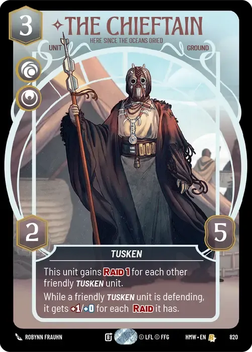
Natural Elegance – If J.R.R. Tolkien was going to design a card border for a game, it’d be something like this. It seems to vaguely resemble the Elven architecture of Middle Earth while still showing up in a Star Wars card game. Very different from what we’ve seen up to this point and a nice addition to the various card treatments. Side note, why is The First Legion in this style? Are they Ewoks wearing costumes?

B Tier
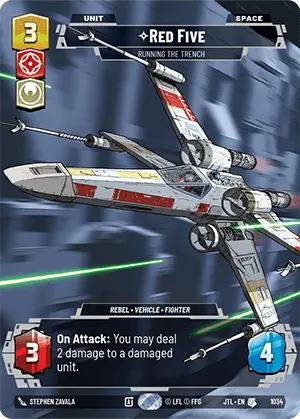
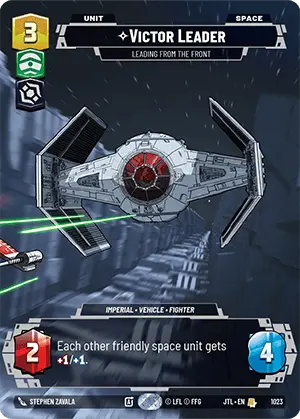
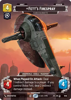
Jump to Lightspeed Prestige – Setting the standard for prestige cards of future sets this style saw near universal love especially with some of the art pieces stretching over multiple cards.
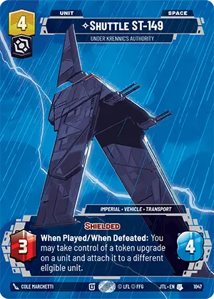

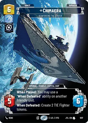
World Between Worlds – If you are not sure what this phrase means, you need to catch up on some Rebels episodes.


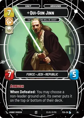


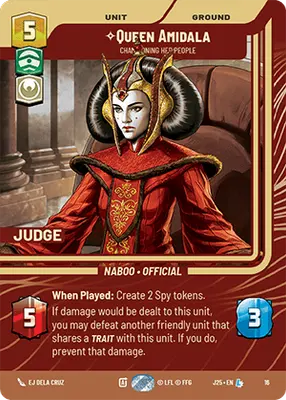
Judge Promos – Nicely put together and keeps the aspect icons all in the correct colors. Biggest downside is looking a bit like a Star Trek: the Next Generation computer console.




C Tier
Weekly Play Version Two – Tremendous improvement over the fog bordered weekly pack cards. The differences between this treatment and the Jump to Lightspeed Prestige are subtle but are there.


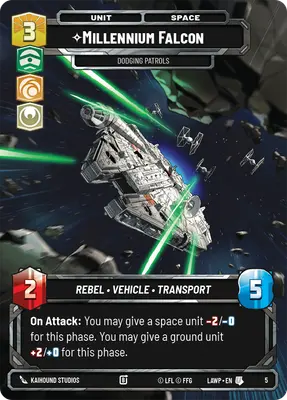

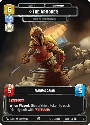
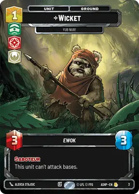
Stand Alone Prestige – When a Prestige card looks basically like the weekly play pack cards how prestigious can it actually be considered? Granted the art on these is really awesome but the border could be a little bit more spiffy.
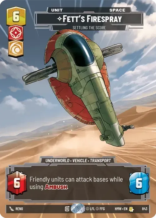
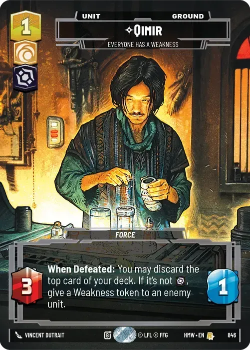

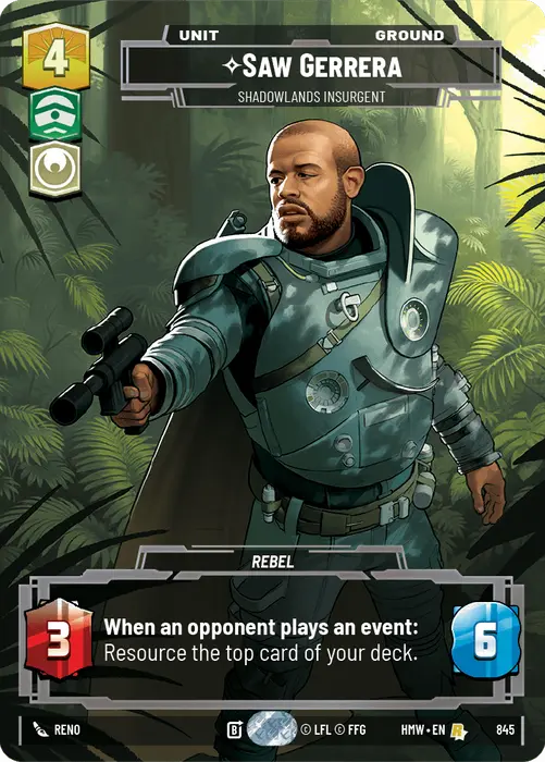
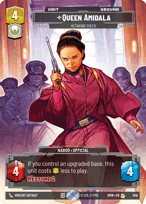
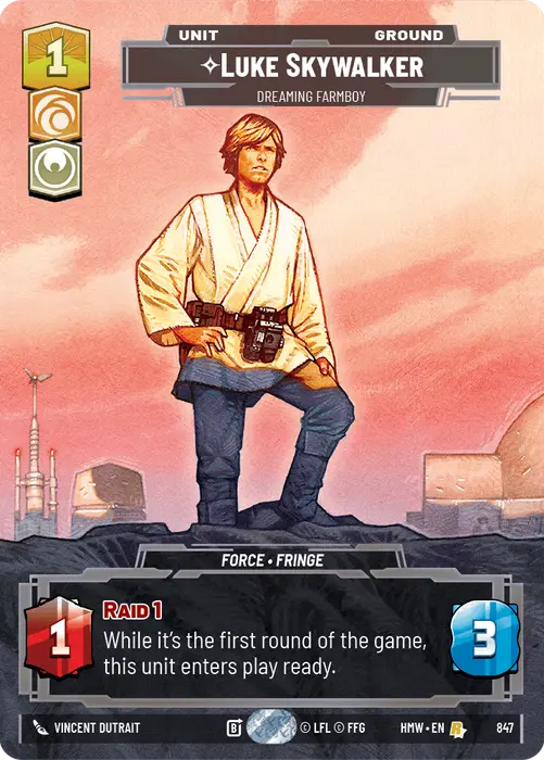
Extra Vertical Bar – This has been used for all kinds of prize wall, day two, and other special items. They are basically just the weekly play version two or the stand alone prestige but with an extra bar down the left side.
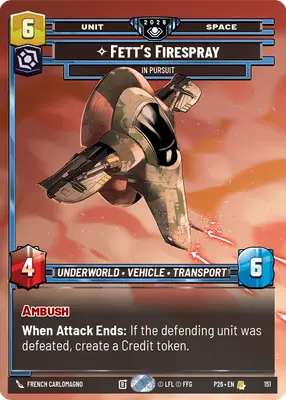


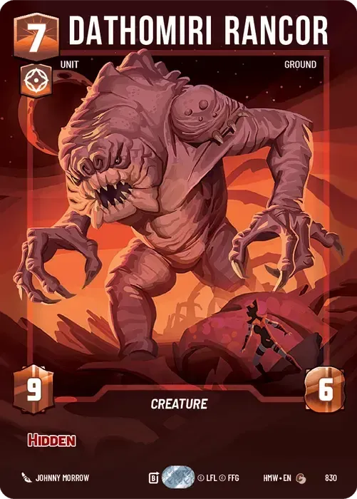
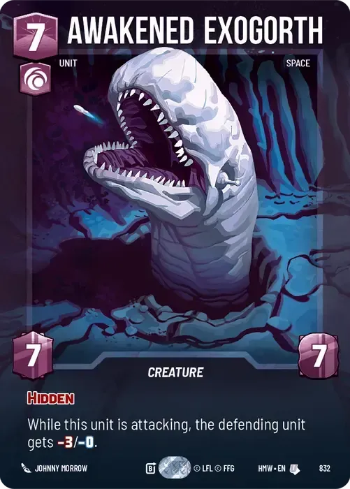
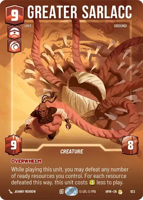
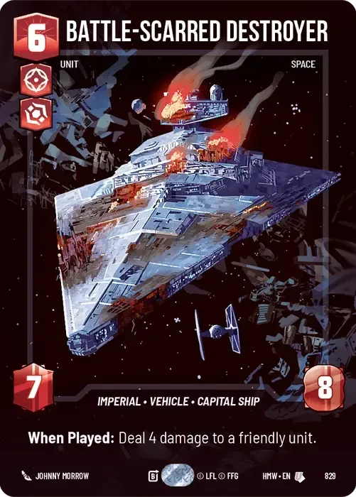
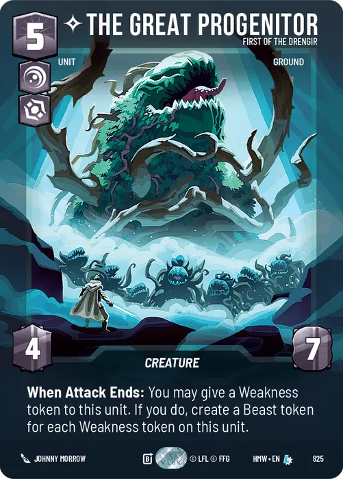
Colossal Prestige – Big things need to somehow show that they are big. The art on these do a great job at scale by putting something small in the image with the giant main subject. Would have been better if the aspect icons and the numbers were the right colors.

D Tier
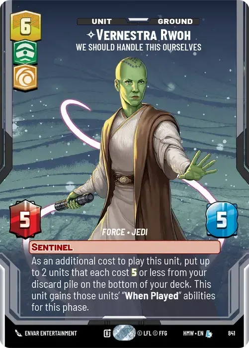
Force Prestige – The foreground art on these are usually pretty awesome. The card frames are kind of boring and the card backgrounds are almost always just some swirls of monotone coloring. We’ve also been seeing this style since Legends of the Force and it could be time to retire it.

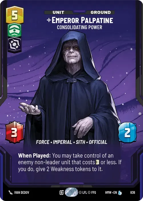


2026 Convention Exclusive – Where’d the color go? This is obviously what the art department was going for stylistically but it seems a little bland. At least the characters could have been lightly colorized.
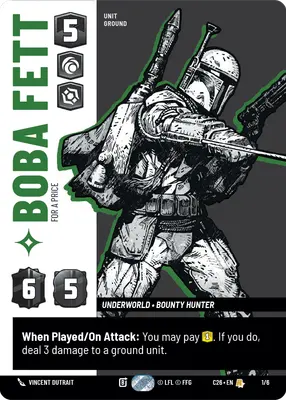

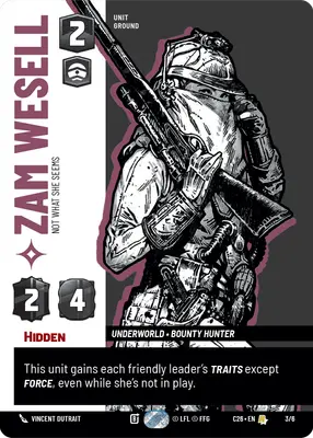


Wanted – Speaking of not having color we’ve got the wanted puck style. They do a good job at mimicking what we’ve seen on the screen. Not sure they have the same impact on a physical card that attempts to show a hologram.

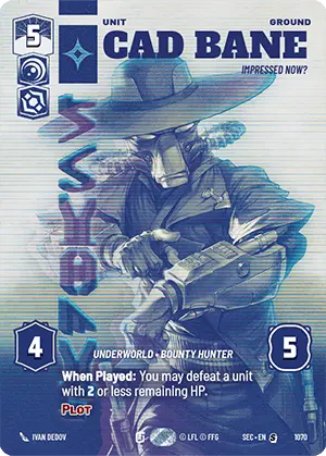

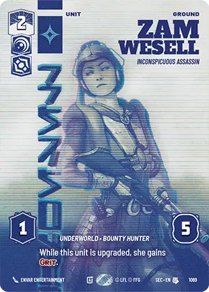
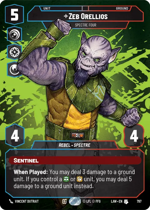
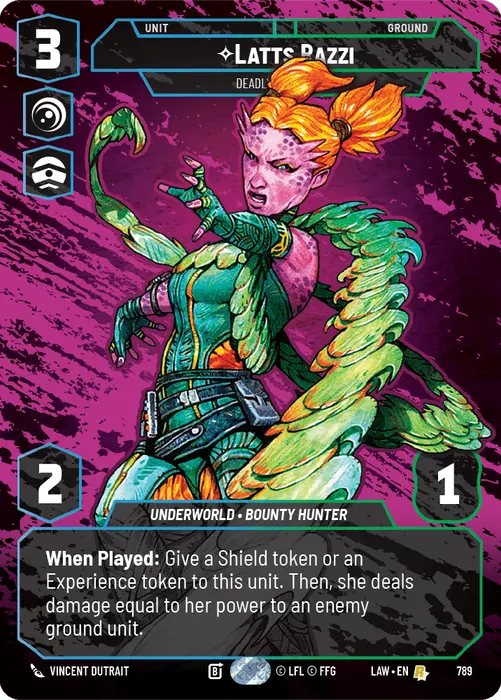
Graffiti? – The foreground art is mostly good. The backgrounds are just crazy pops of color. In some cases it seems to work and in others they can be hard to look at.


F Tier
Fog – Some of these work better than others and the alternate artwork is nice in many cases. However, overall the color blend on the outer edges was never quite good enough. It was a wise choice by the FFG art department to switch away from these.


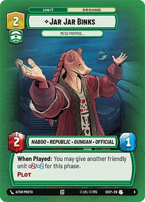


Also down in this basement tier would be just any of the above but with Finn.